Mastering Landing Page Alignment: Speed, Scent, and Social Proof
Learn how speed, message scent, and social proof align your landing pages with user intent to increase conversions and reduce drop-offs.

You're spending thousands of dollars on ads. The clicks are coming in, but the conversions? Nowhere near where they should be.
Data show that the average landing page conversion rate is just 6.6% across industries. This means over 93% of the traffic you're paying for leaves without taking action.
The problem rarely lives in the ad itself. It lives in what happens after the click: the landing page experience.
Specifically, three things determine whether a visitor converts or bounces:
- How fast does your page loads
- How well it matches the promise your ad made, and
- Whether it gives visitors enough reason to trust you.
Speed reduces friction, Scent reinforces intent, and social proof builds trust.
When you master all three, your landing page starts being your highest-performing sales asset.
P.S.: Need support turning clicks into conversions without wasting ad spend? 9AM helps you build high-converting landing page systems that align speed, scent, and social proof for maximum ROI. From page audits to full funnel optimization, we focus on measurable, profitable growth. Book a free strategy call with us now!
TL;DR
- Most landing pages bleed conversions because speed, scent, and social proof are treated as separate concerns instead of a single system.
- "Conversion scent" is about consistency between what your ad promises and what your landing page delivers. Break it anywhere in the funnel, and you lose the conversion.
- Speed is the foundation. A 1-second delay costs 7% in conversions, and slow pages signal low quality to potential customers before they read a word.
- Social proof works hardest when placed strategically: high-impact logos belong above the fold while testimonials belong near the CTA, where doubt peaks.
What is "Conversion Scent" and Why It Matters
When someone clicks your ad, they arrive with an expectation. "Conversion scent" is how well your landing page honors that expectation.
For instance, if your ad promotes “FREE SHIPPING” and that phrase disappears on the landing page, you’ve broken the scent trail. This break creates friction, confusion, and an immediate bounce response.
The stakes are real. Consistent brand presentation across every touchpoint can increase revenue by up to 23%. This consistency starts the moment someone clicks.
From what we have observed, even small message shifts reduce trust. A headline tweak, a missing benefit or a different tone; each gap chips away at confidence.
You can consider scent as the invisible thread connecting your ad to your landing page to your thank-you page. The moment the landing page feels different from the ad, the user's brain registers a mismatch, and they leave.
To learn more about conversion scent, you can watch this video:
How Landing Page Speed Impacts Conversion Rates
Before your message persuades, your page must load. Speed shapes the first impression and directly affects conversion rates.
In our experience, teams mostly obsess over headlines while their page takes four seconds to render. Visitors rarely wait that long.
Remember that every millisecond matters for ROI.
Users start judging your page's value before it even fully loads. Data shows that 53% of mobile users abandon pages that take longer than 3 seconds to load. That abandonment is an instinctive quality check.
This abandonment acts as a quality filter. A slow page subconsciously communicates poor customer service, weak security solution standards, or unreliable delivery.
We have observed that hesitation at load creates hesitation at checkout. If your page stalls, confidence drops.
Technical Tactics to Improve Landing Page Load Speed
Most speed issues are fixable without a full site rebuild. We suggest starting with these high-impact fixes:
- Compress images. Oversized images are the most common culprit behind slow load times.
- Enable browser caching so returning visitors aren't downloading the same assets twice.
- Implement a Content Delivery Network (CDN) to serve your page from servers closest to the user.
- Minimize JavaScript execution to improve your Time to Interactive, the point where a visitor can actually click, scroll, and submit a form.
Pages that load in 1 second convert at 3X the rate of pages that take 5 seconds. And remember: improvements must hold up on mobile devices.
Mobile Responsiveness and Core Web Vitals
Mobile performance deserves separate attention. Mobile pages take significantly longer to load than desktop pages on average, yet mobile traffic represents more than half of sessions.
Responsive design alone does not guarantee speed. Your pages need to pass Google's Core Web Vitals benchmarks, including Largest Contentful Paint (LCP) and Cumulative Layout Shift (CLS). These metrics measure load speed and visual stability in real conditions.
Mobile pages take 87.84% longer to load than desktop pages on average. Yet mobile traffic accounts for over half of user sessions.
Test on real 4G networks. Check tracking scripts. Audit heavy visual blocks. If your layout shifts while users try to submit a form, you’re bleeding conversions.
This is where most teams underestimate the impact of technical performance. Speed does not sit in the background. It shapes trust from the first second.
Now let’s discuss the second pillar: Scent.
The "Scent": Matching Intent to Offer
Getting the click is only half the job. What happens after determines whether that click turns into revenue.
Conversion scent depends on alignment. Your landing page must reflect the exact promise that triggered the click.
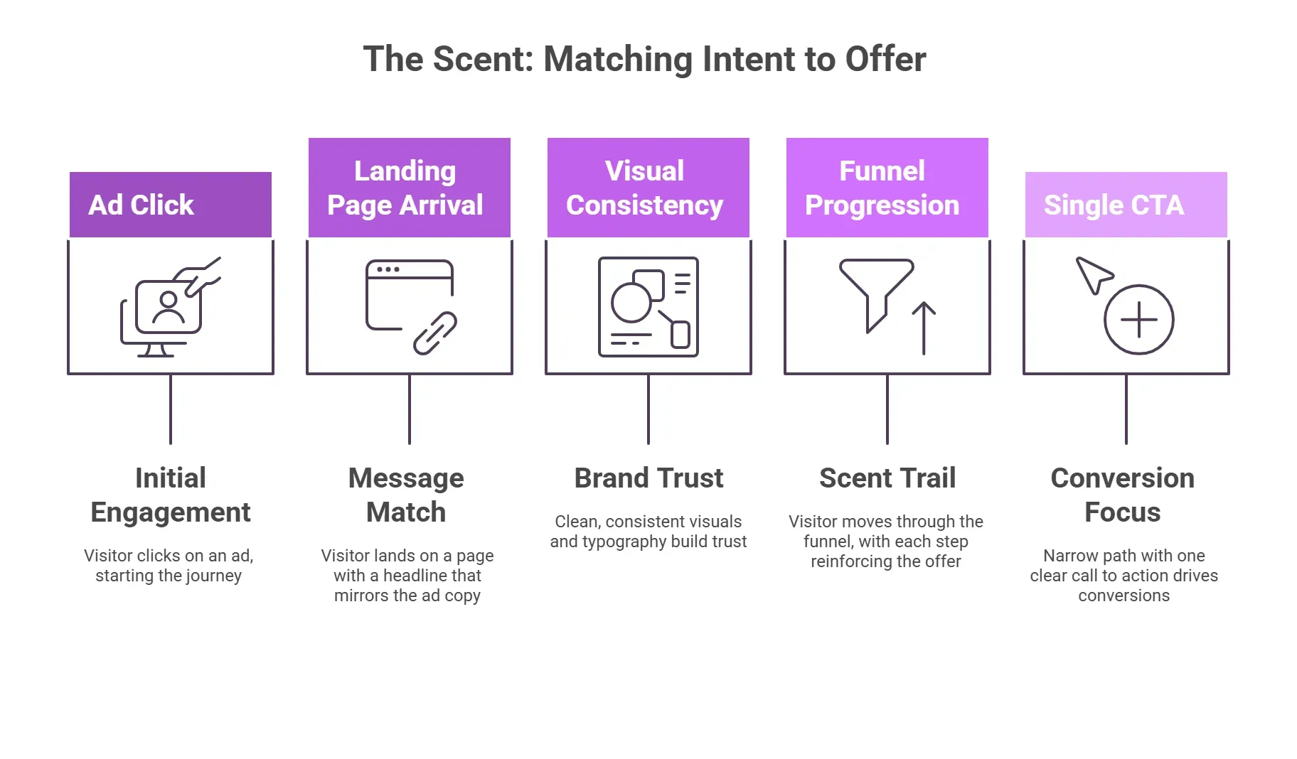
Message Match: The Ad-to-Page Connection
Your landing page headline needs to mirror your ad copy closely enough that the visitor feels they've landed in the right place.
Use the same keywords from your ad in the H1 of your landing page. For example, if your ad promotes “free audit for e commerce brands,” your landing page headline should repeat that exact phrase. Word-for-word consistency reduces cognitive friction and keeps the conversion path intact.
This matters more than you realize. Using the same keywords adds familiarity.
Personalized CTAs convert 202% better than generic ones. The same logic applies to your headline: the more it speaks directly to what the visitor came looking for, the more likely they are to stay and act.
This is where many teams' performance weakens. They polish the ad, and then they rewrite the landing page creatively. The connection breaks, and conversions drop.
In our experience working with performance teams, message match remains one of the fastest conversion lifts available.
Visual Consistency and Brand Trust
Visitors process visuals before words. In fact, 55% of brand first impressions are visual. If a visitor clicks a clean, minimal ad and lands on a cluttered page with mismatched fonts and stock photos, the trust is gone before they read a single line of copy.
Disparate colors, inconsistent imagery, and mismatched typography create cognitive dissonance. The visitor can't quite explain why something feels off, but they feel it. And they leave.
Pro tip: We recommend maintaining a simple style guide that governs both ad creative and landing page design. Your ad and landing page should feel cohesive. When the visual environment stays consistent, confidence stays intact.
Maintaining the "Scent Trail" Through the Funnel
Remember that the scent doesn't end at the landing page. It needs to carry through from the email or ad all the way to the thank-you page. Every step in the funnel should carry the same promise, the same tone, and the same offer.
One practical adjustment is to remove navigation clutter that pulls attention away from the primary action. Every extra link is an exit ramp away from your conversion goal.
Data supports this, too. Pages with a single CTA convert at 13.5%, compared to 10.5% for pages with five or more links.
Therefore, we recommend keeping the path narrow. Give visitors one clear action to take, and make sure every element on the page points toward it.
Social Proof: The Trust Factor
Proof reduces hesitation at critical moments. Visitors need to know someone else has already made this decision and come out better for it.
The Best Types of Social Proof for B2B
Not all social proof carries equal weight. For B2B buyers, the hierarchy looks like this:
- Case studies
- Reviews
- Logo walls
Case studies do the heaviest lifting because they show a specific problem, a specific solution, and a measurable outcome. Reviews add volume and relatability. And logo walls establish credibility at a glance.
The numbers make a strong case for investing here. Research shows that displaying reviews can increase conversion rates by up to 270%. Testimonials placed near objection points on sales pages often improve response rates across industries.
In our experience, depth outperforms quantity. Two or three strong case studies convert better than a page filled with vague praise.
Strategic Placement for Maximum Impact
Once you have strong proof, placement determines its impact.
Above-the-fold space should include recognizable logos or credibility markers. These establish trust before the visitor invests time in reading.
Detailed testimonials and case study excerpts work best near your pricing section or CTA. This is where doubt peaks. A well-placed quote from a recognizable brand or a relatable customer can be the difference between a form submission and an exit.
Research shows that 96% of consumers look for reviews when making purchasing decisions. So, if your social proof is buried at the bottom of the page, most visitors will never see it.
From what we have seen, the most effective pages place trust elements exactly where friction appears. Align proof with moments of doubt, and conversions improve.
How to Align All Three for Higher Landing Page Conversions
Speed, scent, and social proof each do a job on their own. But the pages that consistently outperform are the ones where all three work together.
Conduct a "Scent Audit" on Your Pages
One of the simplest alignment checks requires no tools at all. Print your ad and your landing page side by side.
Look closely at visual consistency. Do the colors match? Does the imagery feel related? Is the tone consistent?
Then read your ad copy and your landing page headline out loud. Do they sound like they came from the same brand, speaking to the same person, about the same offer? If there's a tonal gap, your visitors are feeling it too.
Pro tip: We recommend aiming for a 5th-grade reading level. The goal is clarity, and clarity builds confidence in the reader. In fact, data shows that landing pages using more complex wording are associated with a 24.3% decrease in conversion rates.
Continuous Optimization and Testing
Alignment is not a one-time fix. User expectations shift, ad creative gets refreshed, and what worked six months ago may not work today.
A/B test one variable at a time. If you change the headline and the hero image simultaneously, you'll have no idea which one moved the needle.
Test headline match first, then social proof placement, then page speed improvements. Build a clear picture of what's actually driving conversions.
The brands that win in the long term treat their landing pages as active revenue assets. They measure, adjust, and refine continuously.
Next, let’s examine real examples to see how these principles work in practice.
5 Real-World Examples of Perfect Landing Page Alignment
These brands demonstrate how speed, scent, and social proof work together in practice.
1. Mindbloom: Impeccable Social Proof
One of our clients, Mindbloom, operates in one of the hardest conversion environments imaginable: convincing someone to try at-home ketamine therapy. The trust bar is extraordinarily high.
Their landing page clears it with layered, specific social proof. Client testimonials go far beyond generic praise. One reads, "My PTSD and depression symptoms are gone. I absolutely love my life." These are personal, specific, and emotionally resonant.
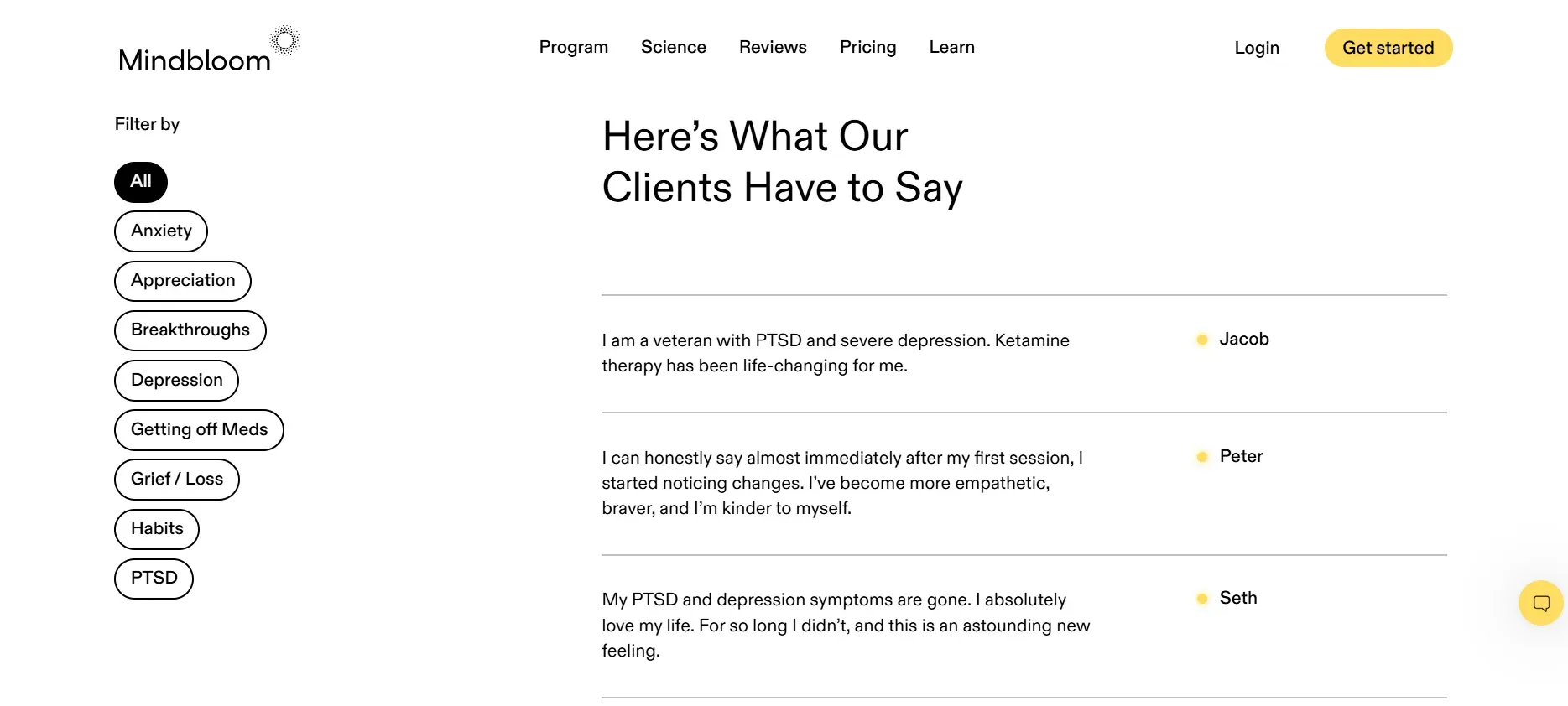
This layered approach prevents doubt from forming. Instead of overwhelming visitors with blocks of text, proof appears exactly where friction might emerge.
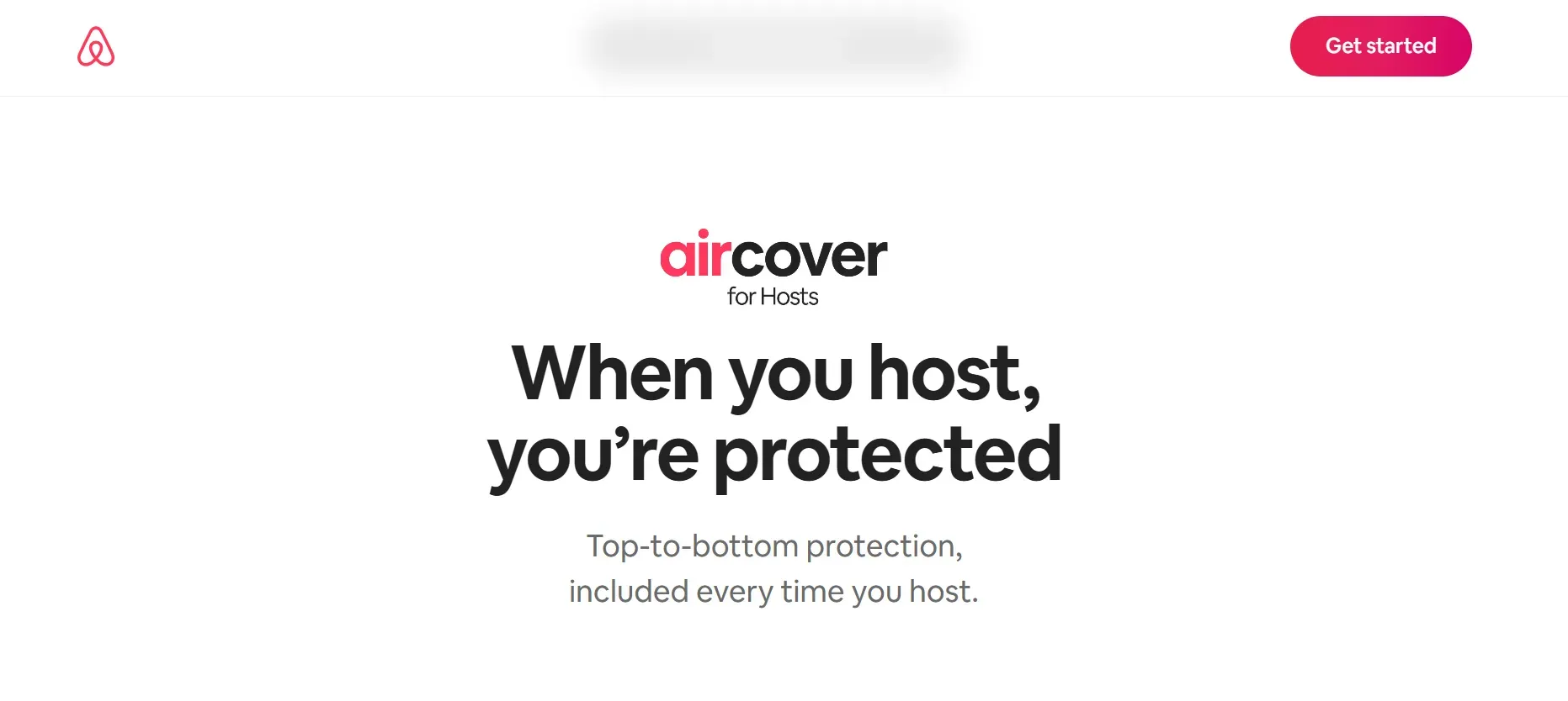
2. Airbnb (Host): Trust-First Alignment
Airbnb is another client we have worked with. Its host landing page is a masterclass in scent matching. The headline speaks directly to the visitor's intent:
"Your home could make [insert amount] on Airbnb."
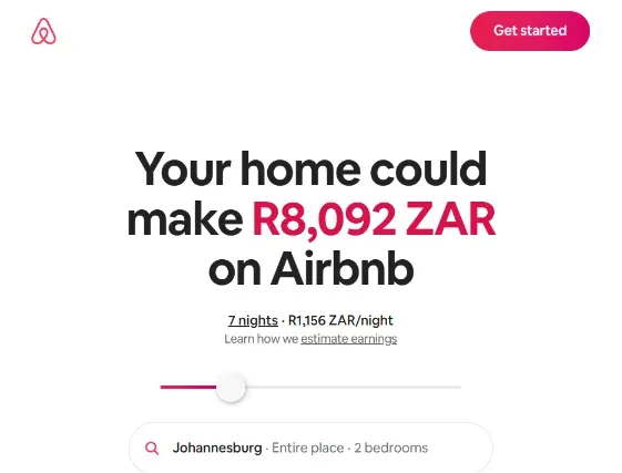
There's no ambiguity. If you clicked an ad about earning money as a host, this page confirms immediately that you're in the right place.
The AirCover protection feature is positioned prominently to counter safety concerns, acting as a powerful social proof mechanism. The scent match is seamless: promise income, address risk, show proof.
3. Slack: The Social Proof Powerhouse
Slack structures its Enterprise landing page with deliberate proof sequencing. It opens with a bold positioning statement: “Reimagine work for your entire enterprise.” The promise is visionary and high-level.
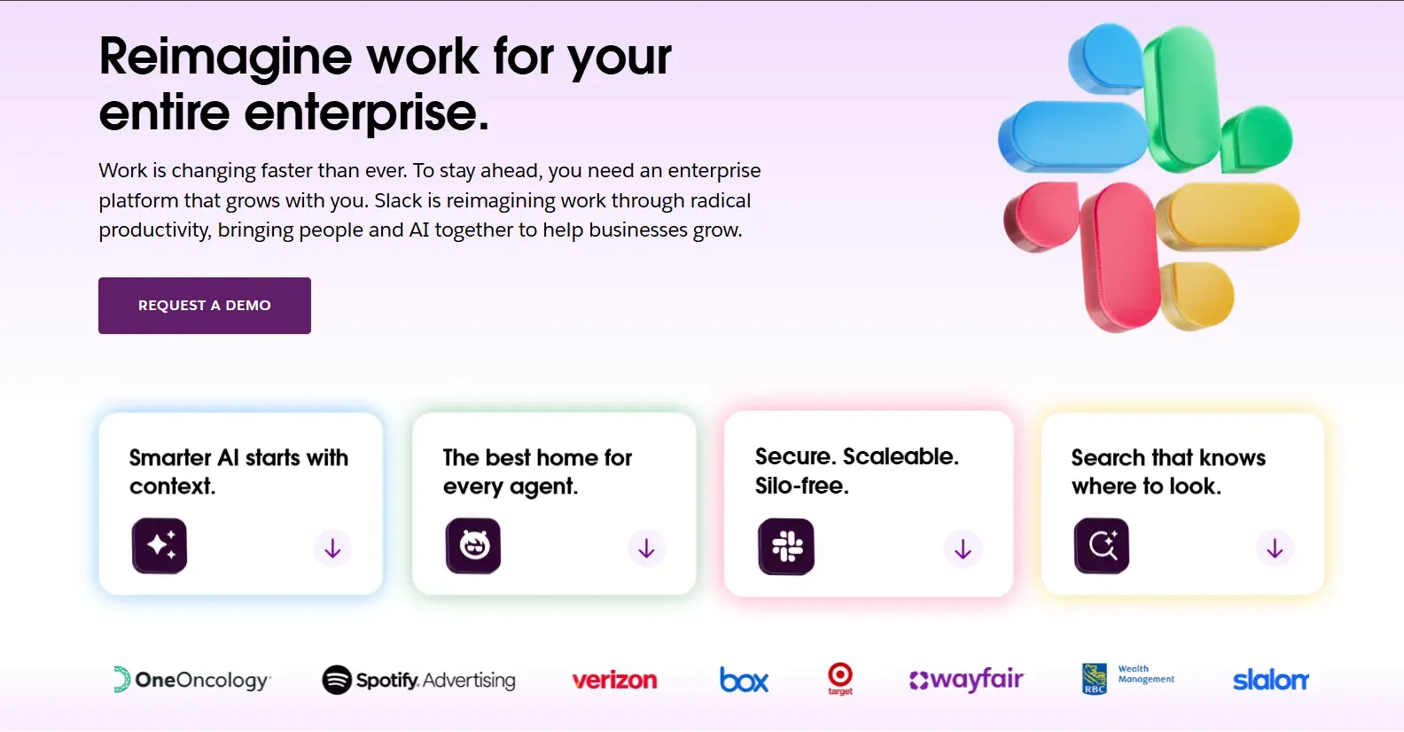
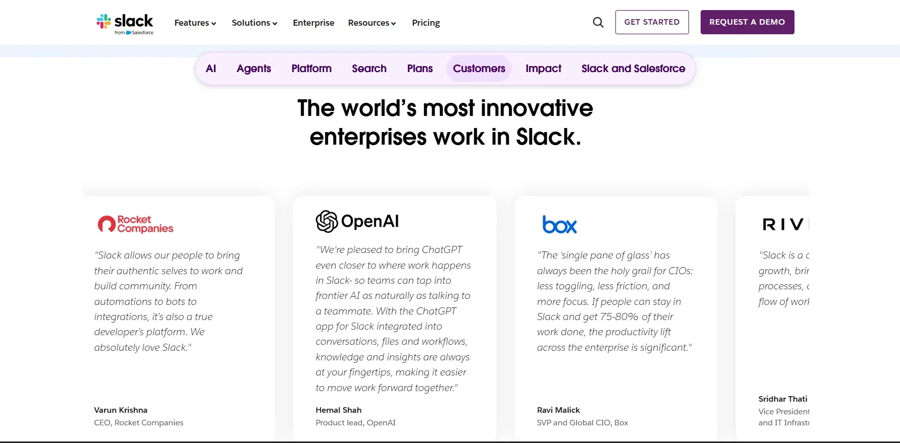
Immediately after, Slack reinforces that promise with recognizable enterprise logos and executive testimonials from organizations like OpenAI, Rocket Companies, and Box. This early placement signals peer adoption before asking for commitment.
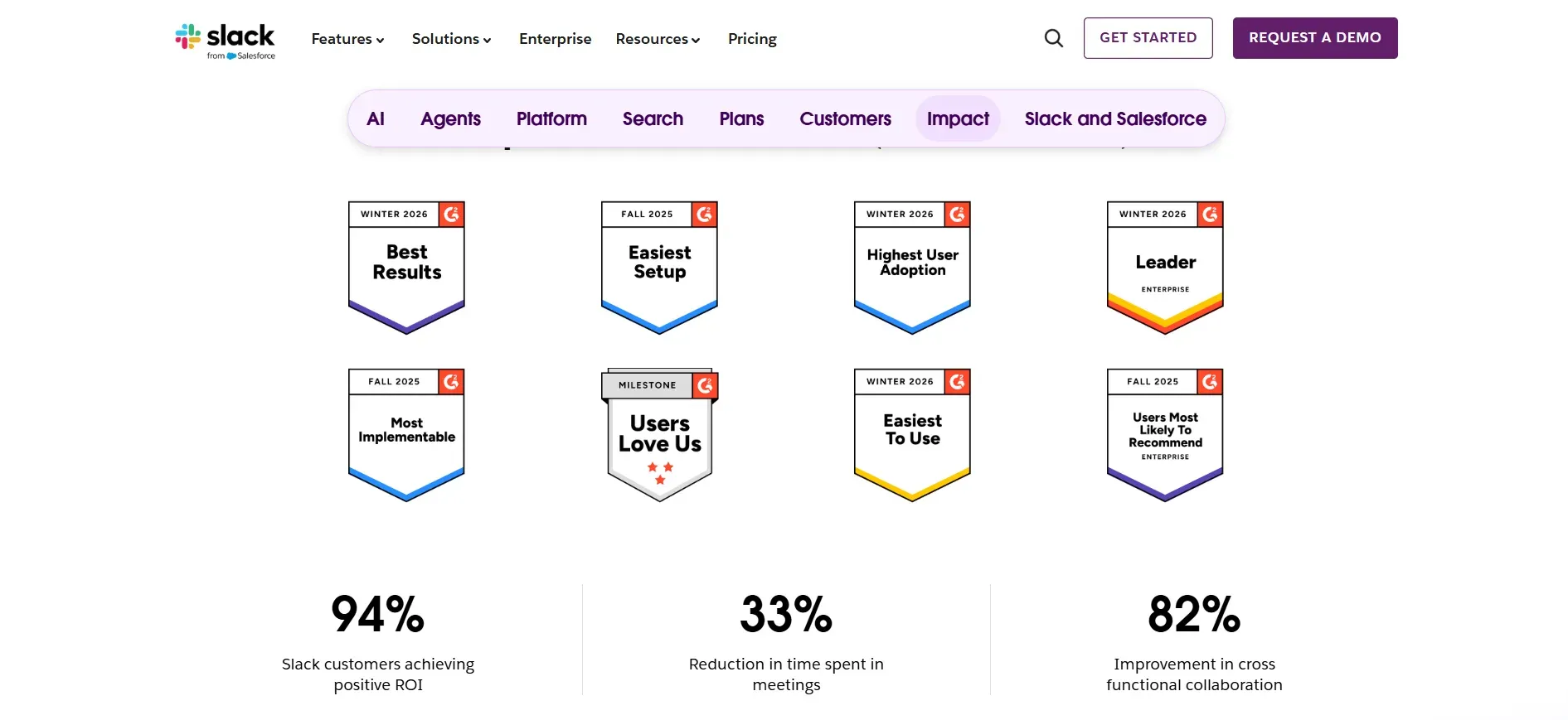
Next, their third-party validation appears in the form of recognition badges: Leader, Highest User Adoption, Users Most Likely to Recommend. These awards externalize credibility.
Finally, Slack introduces quantified impact metrics: 94% positive ROI, 33% reduction in meeting time, and 82% improvement in cross-functional collaboration.
This sequence works because it mirrors enterprise decision logic:
Vision → Peer Adoption → Market Validation → Measurable ROI → CTA.
The scent remains intact from promise to proof, reinforcing trust at every stage.
4. HelloFresh: The Perfect Offer Match
HelloFresh is another client of ours, and its landing page leads with the headline:
"Whatever your week looks like, dinner's covered."
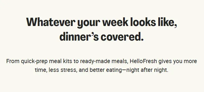
It's a direct answer to the exact frustration that drives people to search for meal delivery services in the first place.
This is information scent at its best. The promise of convenience made in their ads is restated immediately on the page in plain, conversational language.
The visitor doesn't need to search for confirmation that they're in the right place. The headline gives it to them instantly.
5. Notion: The Masterclass in Minimalist Alignment
Notion's Enterprise landing page is built for buyers who need to justify a platform decision to an entire organization.
The headline, "Knowledge and work. Connected." mirrors Notion's positioning in their ad messaging perfectly. Clean, confident, and broad enough to speak to every team while staying specific enough to communicate integration as the core value.
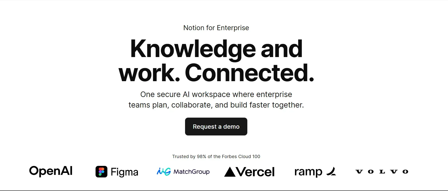
Social proof is placed with intent. Logos from Figma and Volvo sit directly below the CTA button, anchoring trust right where the decision happens.
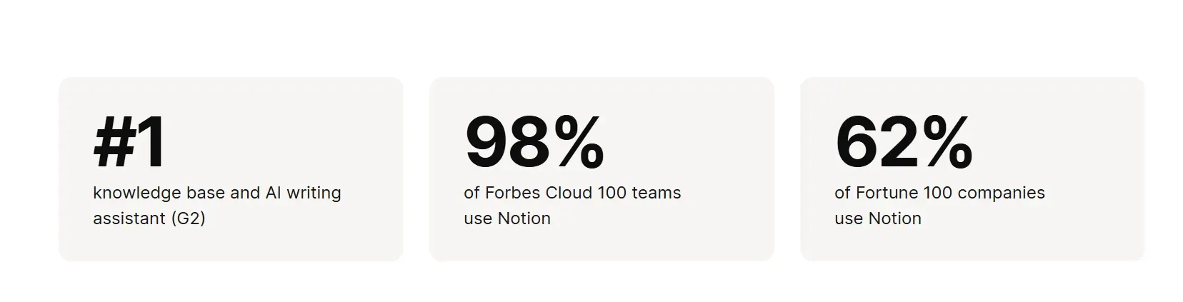
As the visitor scrolls, the authority layer deepens. Three stat-driven tiles reinforce dominance: a #1 ranking for knowledge base and AI writing assistant on G2, adoption by 98% of the Forbes Cloud 100, and usage by 62% of Fortune 100 companies.
The page introduces the vision first. Then it establishes market validation and enterprise adoption. The structure supports internal justification, which is essential in enterprise environments.
Common Pitfalls in Landing Page Alignment
From our experience, even well-resourced teams get these wrong. Here are the two mistakes that quietly kill conversion rates before the page ever gets a chance to perform.
The "Bait and Switch" Headline
When you run a bold, provocative ad and land visitors on a page with a completely different headline, friction increases immediately. The visitor clicked because of a specific promise. When the landing page doesn't reflect that promise, trust evaporates immediately.
This happens more than most teams realize. An ad targets "affordable CRM for startups," but the landing page headline reads "The World's #1 Business Platform."
The claim may be accurate. But to the visitor who clicked expecting something tailored to them, it feels like a bait and switch.
We recommend treating your landing page headline as a direct continuation of your ad. The transition should feel seamless. When the promise stays consistent, momentum continues.
Ignoring Mobile Speed for Desktop Design
A large portion of global web traffic (62-64%) comes from mobile devices. Yet many landing pages are still designed on large desktop monitors first, with mobile treated as a secondary adaptation.
Visual elements that feel expansive on a widescreen monitor can overwhelm a small display. Large hero images, autoplay background videos, and heavy design assets increase load times and delay the first meaningful interaction.
On mobile, speed shapes behavior. A delay of even one second can lower engagement and steadily impact conversion.
From what we have observed, mobile-first thinking produces stronger results. Design for the smaller screen first. Then scale upward. When mobile performance improves, overall conversion rates typically follow.
Build High-Converting Landing Pages with 9am
Remember that most landing pages don't fail because of bad design. They fail because speed, scent, and social proof are treated as separate concerns instead of a single, unified system.
The brands that consistently convert above 10% have one thing in common: every element on their landing page works toward the same goal. Each piece reinforces the next, and the visitor feels it even if they can't articulate why.
Getting all three right takes a team that understands how performance, creative, and conversion strategy connect.
At 9AM, we help you build landing page systems that turn paid traffic into measurable revenue. From page audits to full-funnel optimization, every decision we make is tied to outcomes that matter.
Contact 9AM today, and let's find what's costing you conversions.
Frequently Asked Questions
1. Does social proof actually increase conversion rates?
Yes. Research from the Spiegel Research Center found that displaying product reviews can increase conversion rates by up to 270%. Impact is strongest when social proof appears near decision points such as pricing or the CTA, where hesitation typically increases.
2. What is “conversion scent” in marketing?
Conversion scent refers to the consistency between what an ad promises and what the landing page delivers. When the headline, visuals, and offer on the landing page mirror the ad that brought the visitor there, scent is maintained. When they don't match, visitors lose confidence and bounce.
3. How fast should a landing page load?
Under 3 seconds is the baseline, but the real target is 1 second. Pages that hit that threshold convert significantly better than those that don't. Use Google's Core Web Vitals to measure and track your load speed against current benchmarks.
4. What are the 3 elements of landing page alignment?
The three elements are speed, scent, and social proof. Speed ensures the page loads before the visitor loses patience. Scent ensures the page delivers on the promise the ad made. Social proof gives the visitor enough confidence to take action. All three need to work together for consistent conversion performance.
5. Can 9AM help with optimizing my landing page?
Yes. 9AM works with brands across industries to audit and optimize landing pages for conversions. Page speed, message alignment, and social proof placement are all covered, with every decision tied to measurable outcomes.
6. Does 9AM just advise, or do you execute the optimizations?
9AM handles both. We develop the strategy and execute the changes across creative strategy and funnel architecture. Every adjustment is implemented with conversion performance and revenue growth in focus.
Appendix
- https://unbounce.com/conversion-rate-optimization/landing-page-stats/
- https://www.lucidpress.com/pages/resources/report/state-of-brand-consistency
- https://www.thinkwithgoogle.com/marketing-strategies/app-and-mobile/mobile-page-speed-new-industry-benchmarks/
- https://www.portent.com/blog/analytics/research-site-speed-hurting-everyones-revenue.htm
- https://backlinko.com/page-speed-stats
- https://almanac.httparchive.org/en/2022/performance
- https://blog.hubspot.com/marketing/personalized-calls-to-action-convert-better-data
- https://explodingtopics.com/blog/branding-stats
- https://www.emailvendorselection.com/landing-page-statistics/
- https://spiegel.medill.northwestern.edu/how-online-reviews-influence-sales/
- https://www.powerreviews.com/the-complete-guide-to-ratings-reviews/
- https://business.trustpilot.com/guides-reports/build-trusted-brand/the-critical-role-of-reviews-in-internet-trust
- https://www.nngroup.com/articles/legibility-readability-comprehension/
- https://www.shopify.com//blog/landing-page-statistics